The Racial Wealth Gap Like You've Never Seen It Before
New angles on racial inequality as our nation turns 250
“The blessings in which you, this day, rejoice, are not enjoyed in common.”
I had a great time skipping the semiquincentennial celebrations yesterday and instead re-reading Frederick Douglass’s What to the Slave Is the 4th of July?. This year, what strikes me is that that national mood is more closely aligned with Douglass’s sentiment than anytime I remember. D.C. residents are fleeing the city’s July 4 celebrations; the media elite are questioning the direction of the country; and my friends, family, and neighbors are approaching the celebrations with far more national shame - and much less national pride - than in previous years.
My guess is that this section resonates more widely today than in years past:
To him, your celebration is a sham; your boasted liberty, an unholy license; your national greatness, swelling vanity; your sounds of rejoicing are empty and heartless; your denunciations of tyrants, brass fronted impudence; your shouts of liberty and equality, hollow mockery; your prayers and hymns, your sermons and thanksgivings, with all your religious parade, and solemnity, are, to him, mere bombast, fraud, deception, impiety, and hypocrisy — a thin veil to cover up crimes which would disgrace a nation of savages.
Fraud, deception, and hypocrisy certainly seem rampant, even if the savagery of a cage fight at the White House shows how far some of our national elements are from any sense of disgrace.
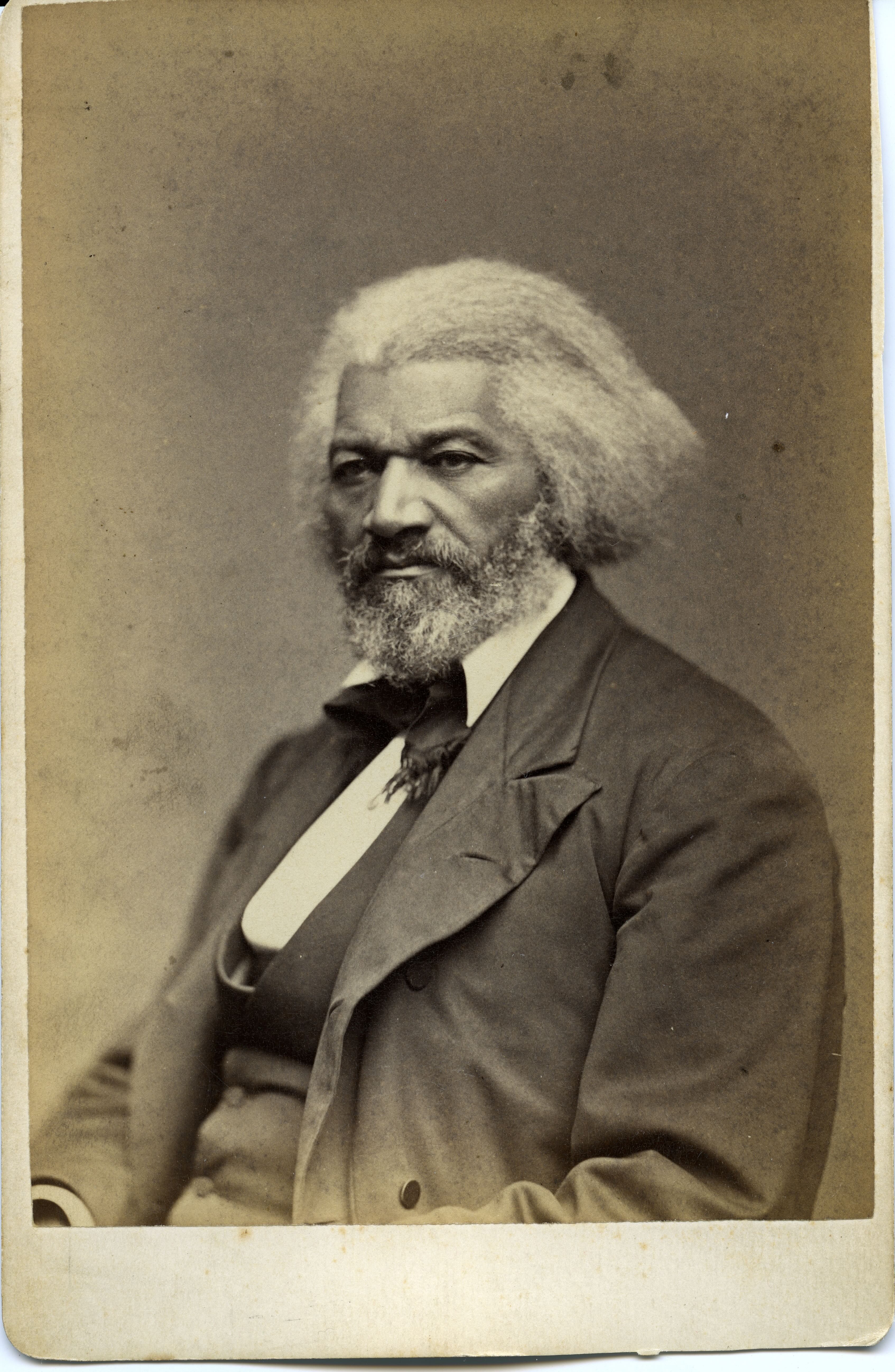
What jumped out at me for the first time, though, was this section:
I say it with a sad sense of the disparity between us. I am not included within the pale of this glorious anniversary! Your high independence only reveals the immeasurable distance between us. The blessings in which you, this day, rejoice, are not enjoyed in common. The rich inheritance of justice, liberty, prosperity and independence, bequeathed by your fathers, is shared by you, not by me.
And so I’m writing a new blog post showing you entirely new angles on the racial wealth gap. Here it is.
The typical White household has six times as much wealth as the typical Black household
If you’ve seen data on the racial wealth gap before, you’ve probably seen some version of this: three bars, one for White households, one for Black households, one for Latino households, showing the median net worth of each.
- The median White household has a net worth of about $284,000.
- The median Black household has a net worth of about $45,200 — less than a sixth as much.
- The median Latino household has a net worth of about $64,000 — less than a quarter as much.
This chart is powerful in its simplicity and ease of communication. The typical White household has about six times as much wealth as the typical Black household. But there are many more things we can say.
Inequality is literally off the charts
The chart below plots net worth at every percentile from the 1st to the 99th, for White, Black, and Latino households. Because inequality is so extreme, you can’t really see what’s going on in this chart without zooming in. Pinch or scroll to push the wealthiest off the chart and see what’s happening at the percentiles where the vast majority of us live. (If you’re reading this on Substack, head on over to InOurEconomy.org for an interactive version.)
Starting at the 50th percentile, you’ll see the same results as are in the bar chart above. But move up or down to see how the wealth gap changes at different places. For instance, a typical working-class White family (25th percentile) has $65k, while a typical working-class Black family has less than $2k. In other words, at the lower end of the wealth bracket, the racial wealth gap is not 6x but 35x. Zoom around a bit and use your pointer to explore the wealth gap at different percentiles.
- Roughly 17% of Black households and 8% of Latino households have negative net worth (they owe more than they own), compared to about 6% of White households.
- The gap shows up at the bottom of the distribution too. By the 10th percentile, White households already have positive net worth (about $5,500) while the typical Black household in that range is roughly $11,800 in debt.
- And the gap widens as you move up. At the 90th percentile, White households have about $2.53 million, compared to about $516,000 for Black households and $519,000 for Latino households — a much bigger dollar gap than at the median.
A different way to see the gap: same net worth, different percentile
The chart above answers “what’s the net worth at percentile X?” This next one flips the question around: for a given net worth, what percentile does that put you at, depending on your race?
Move your mouse (or your finger, on mobile) left and right across the chart. A vertical line will track your cursor, showing you where that net worth level falls on each of the three curves. I had to use a log scale to make this chart legible - the log scale deals with exponential growth well, converting the hockey stick curve you see in the chart above into a more linear chart here. In a better country, we would be able to visualize inequality on a linear scale, but such is the scale of inequality that it’s just not possible.
Try hovering around $45,200 — the Black median from the bar chart above. That same net worth lands white households at only around the 22nd percentile of their own distribution. In other words: the net worth that makes a Black household “typical” would make a white household one of the more financially precarious white households in the country. The same is roughly true for the Latino median of about $64,000, which lands around the 25th percentile of the white distribution.
Zoom in around $1 million and you’ll see that 22% of white families have a net worth in excess of $1 million, compared to just 4% of Black and Latino families.
That’s the real shape of the gap: the middle of the Black and Latino wealth distributions sits closer to the bottom quarter of the white wealth distribution than to its middle.
Why this matters
The median-only bar chart isn’t wrong, but it invites a misreading: that the racial wealth gap is a single, fixed multiple — Black and Latino households have “about a sixth” of what white households have, everywhere, always. In fact the gap changes substantially depending on whether you’re looking at poorer, average, or wealthier households. The wealthiest white families (95th percentile) have more than $4 million more than wealthy Black and Latino families.
None of this is inevitable. It’s the result of policy choices — from redlining and exclusion from federal homeownership programs to unequal access to credit and inherited wealth — that concentrated asset-building among white families for generations. The wealth gap you see in this data isn’t a gap that has anything to do with intrinsic characteristics of white, Black, or Latino people.
It has everything to do with policies that have allowed a very few people to grow fantastically rich while keeping the rest of us - Black Americans in particular - from enjoying in common the wealth of a nation.
Methodology and sources
This analysis uses raw microdata from the 2022 Survey of Consumer Finances (SCF), conducted by the Federal Reserve Board. The SCF is widely considered the gold standard for data on household wealth and financial assets in the United States.
Net worth is calculated at the 1st through 99th percentile, in 1-point increments, separately for households whose primary respondent self-identifies as white, Black, or Hispanic/Latino (referred to here as “Latino,” and inclusive of any race). Percentiles were estimated using Thomas Lumley’s R packages survey and mitools to properly account for the SCF’s multiple-imputation design.
Those of you who are interested in confidence intervals can see them below, for every fifth percentile plus the 99th.
The visualizations above are built with D3.js and Observable Plot. There are no trackers.
Comments
Comments may take a while to appear. I have to approve each one. I wish that weren't the case, but it's the tradeoff for using a an ad-free, privacy-focused comment app.